
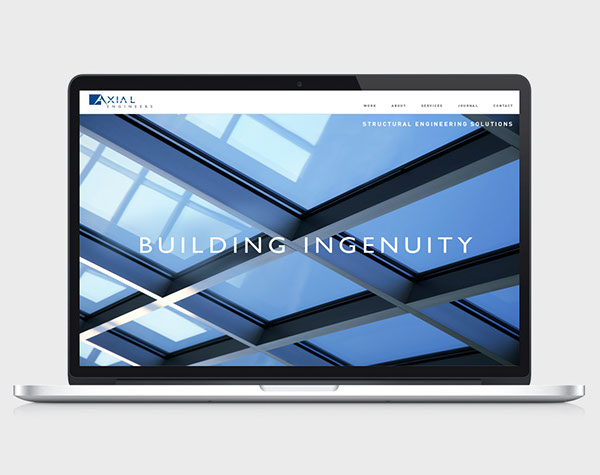
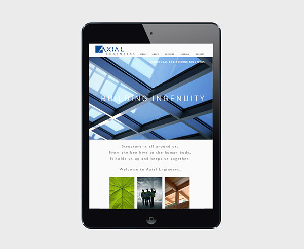

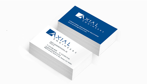

AXIAL Engineers is a structural engineering firm located in Marin County, California.
Gehrig + Kelly named the business and created a Brand Roadmap that defined their core values, brand message, brand personality and finally, their logo and supporting iconography.
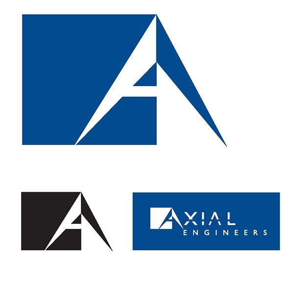
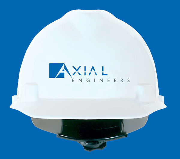
After developing many rough sketches and presenting a quantity of digital roughs to the client, we arrived at a solution that included the “A” in Axial to create the logomark. This was then combined with the customized lettering of the rest of the name to be viewed as one.
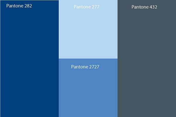
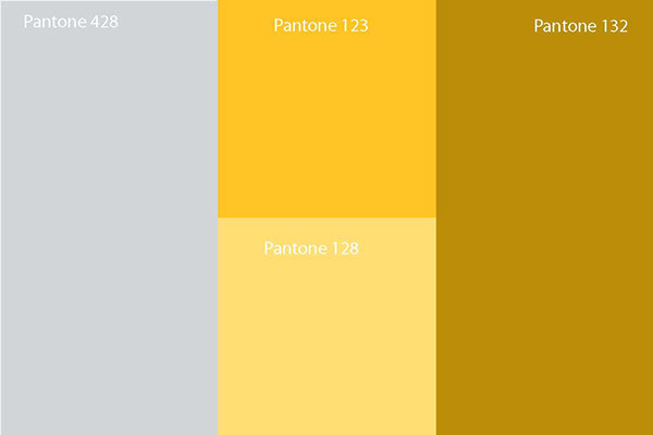
The square represents solidity and weight. The pyramid (the most stable of all shapes) is not seen right away, but moments later. The shape of the “A” points downward and converges into sharp points.This helps to convey preciseness, knowledge and expertise. The color blue was chosen to evoke strength, trust and dependability. The deep grey for calmness and balance.